Karen Ma
Selected Highlights
Summary
Working on the Growth team requires a slightly different approach to product design. We rapidly iterate with our engineering team to prototype experiments and focus on improving the number of qualified leads that are funneled down the sales funnel. As a company that is largely B2B, the growth model is less true product-led-growth and more product-led-sales. Our hopes are to intrigue customers to engage further with the sales team.
Solution
The experiments we ran for the growth team included updates to the sign up flow, the introduction of a home page, improved tutorials, the introduction of a community tier database with a self-serve upgradability path and a no-code interface for loading data (our target action for new users), among other features.
Summary
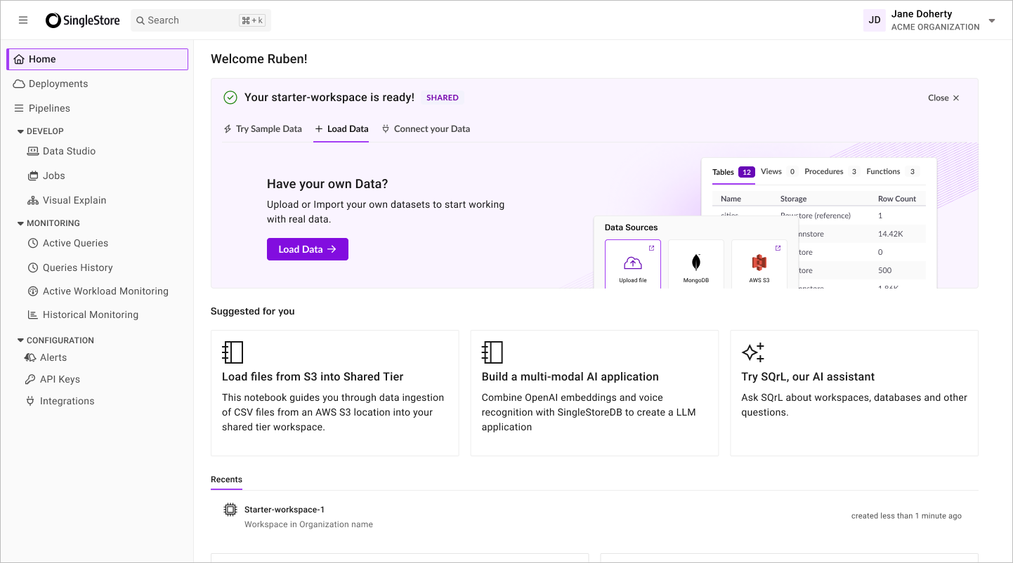
After observing the user interface was getting overcrowded, I initiated a project to revise the navigation on the platform. I created a new object hierarchy to better align to our customers' mental models and scale with our growing feature set.
Solution
This navigation project was scoped to solve for the following themes:
- Scale with feature development
- Keep it clean and focused
- Prevent users from losing context
- Orient users
Outcomes
We did a staged rollout, starting with an opt-in for existing customers and a default onto the new navigation for new customers. After 60 days, we saw an adoption of 20% of customers showing a preference for the new scheme. We defaulted all users to roll onto the new UI and after 30 day mark saw over 90% of customers using the new navigation.

Summary
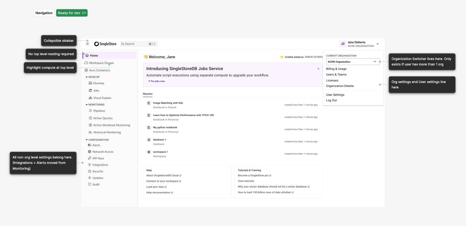
I led the design for the Developer Experience team. As our growth strategy shifted to target small startups and developers, we needed to adapt our portal, which previously was targeted at an administrator persona to support developer use cases. Not only did the product team have a host of new features we wanted to add, we also needed ux strategy to make developers not feel like an afterthought.
Solution
For developing within the platform, we added multi-tab support for SQL and Python Notebooks. We introduced a schema explorer so users could easily see the databases they were querying and see the live updates from their changes. We also took a look at the connection experience for developers who preferred their own IDE to make it a seamless transition from database admin to coding in VS Code or their IDE of choice.
Outcomes
Our introduction of enhanced developer tools in the platform meant we could transition our onboarding tutorials to be interactive files that our customers could run in the platform. We were also able to customize the onboarding experience with different tutorials, leading to a more personal experience. For our existing customers, we unlocked a way for them to keep all their database scripting in one spot, close to the rest of the administrative settings.
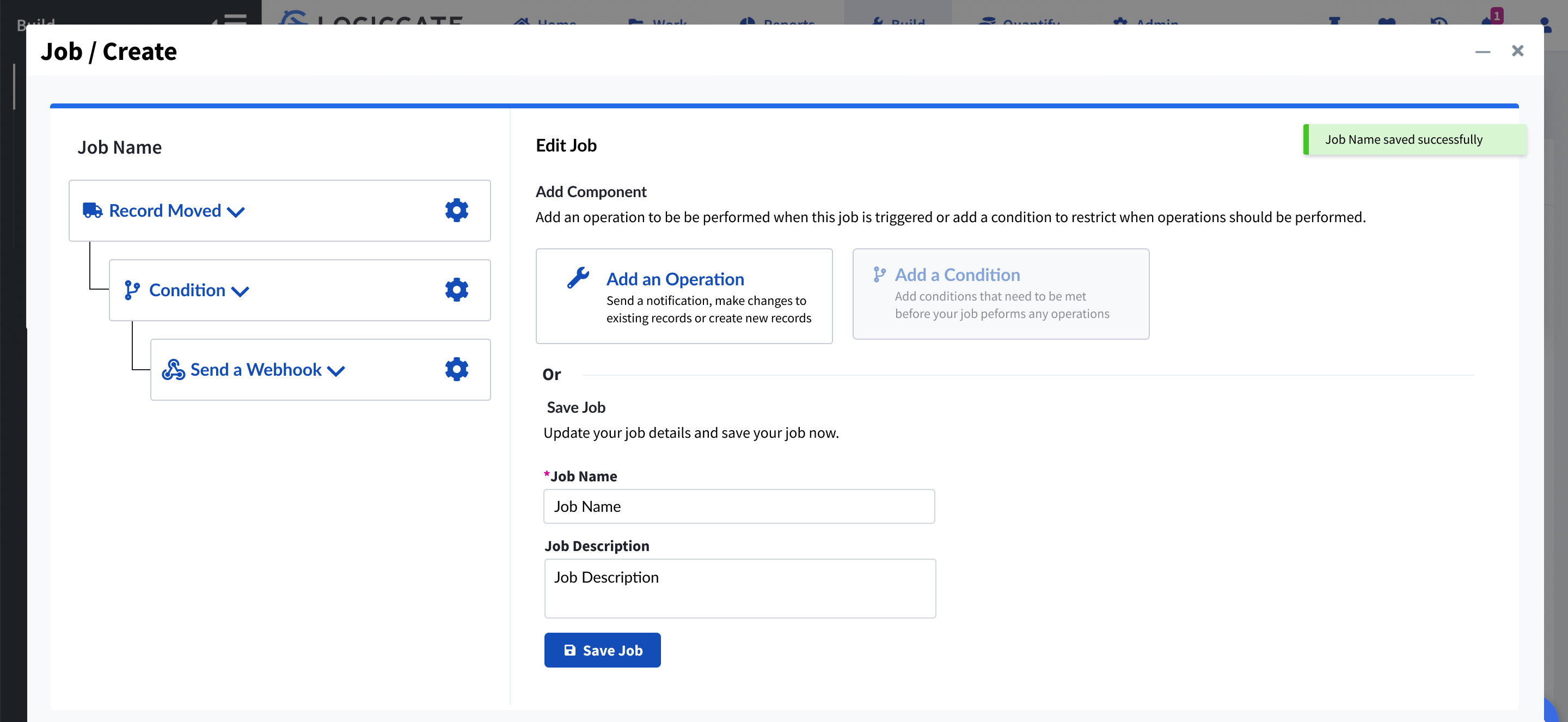
Summary
Automations were a popular customer feature that allowed users to simplify their workflow using automated jobs. However, the complexity of the feature meant that our support staff spent frequent hours working to create new automations and diagnose errors in customer-created jobs. Additionally, as our customers became more familiar with the feature, they began to push the limits of what they could do, leading to errors and a loss of trust in our system.
Solution
After conducting some discovery research and facilitating a series of product workshops, we learned that many customer requests were actually already feasible on the back-end but were obfuscated by a confusing user interface. Also, a lack of trust was preventing customers from increasing their adoption of the feature, and leading to heavy reliance on our internal staff to prove and explain how automations worked. I decided to commit to an interface without such a sharp learning curve which would allow us to shift the user base from our internal customer support staff back to our users and also to invest in more trust-based features for the roadmap.
Outcomes
This project required changes to taxonomy, for more user-friendly language, an overhaul to the rule building interface to better reveal existing functionality, as well as the addition of several audit capabilities, such as a history log, customer facing alerts, and automations preview, to provide a users a way to see what was going on.
Shifting from B2B to B2B2C: An alternative experience for the novice user base
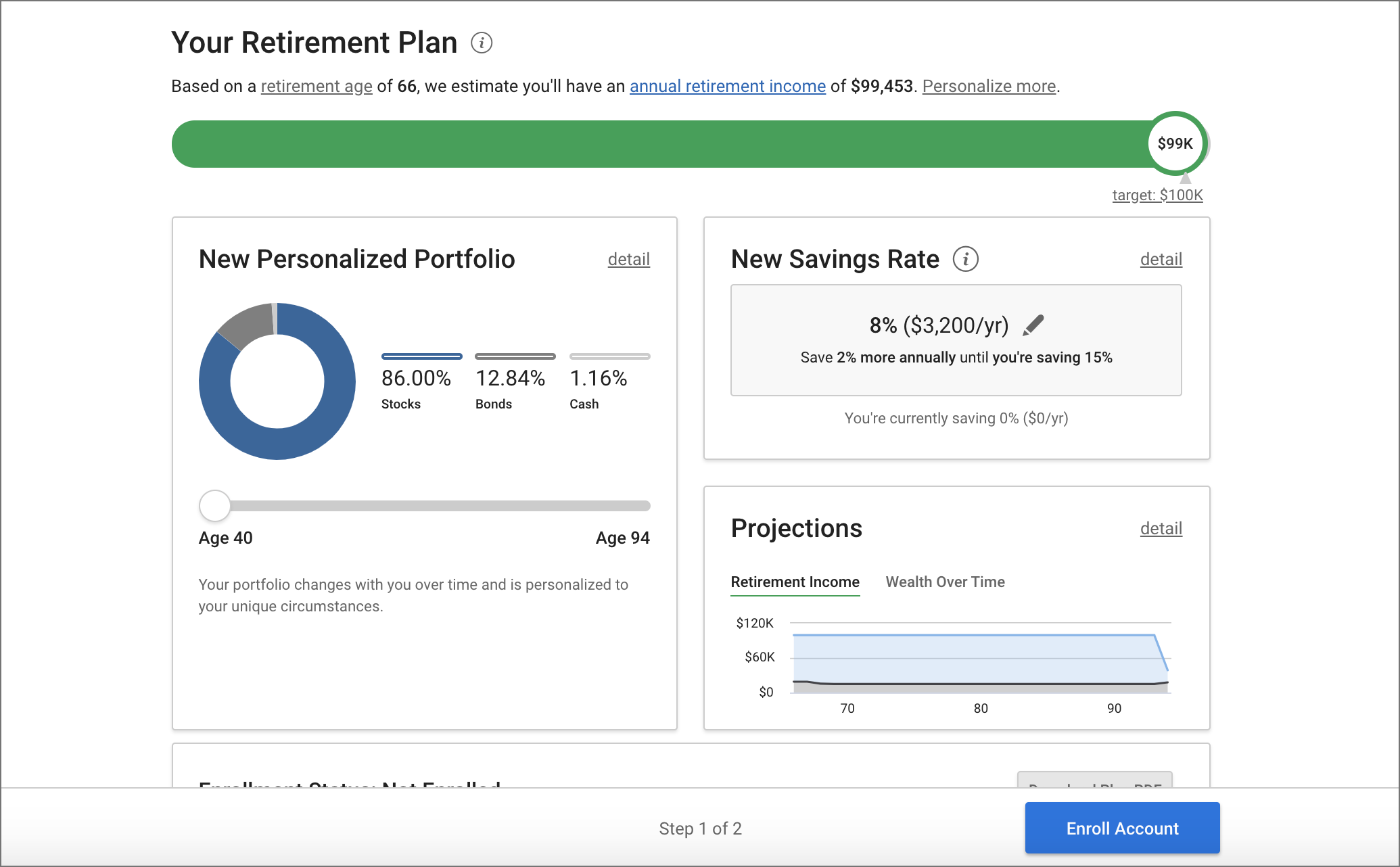
Context
Following a pivot in product strategy from financial advisors to the every day user, I worked to reframe our existing product for a more novice user base, including a simplified onboarding flow and educational dashboard experience. For this project, I worked on the onboarding and dashboard designs with a team of two other designers, as well as leading the technical integrations with 401k plan providers. This was also the first introduction of user experience design into the product development process, requiring design evangelization to the org.
Solution
I led generative research to shape our design strategy for the new target audience and set up usability metrics to inform iterations as we started shipping our features. Novice users were overwhelmed by personalization options in the original interface and were satisfied by starting with some common defaults. Upon receiving advice, users needed more transparency to understand the logic behind recommended actions. Not only did we see an increase in users, we also saw better outcomes for our users, for a product-led growth strategy.